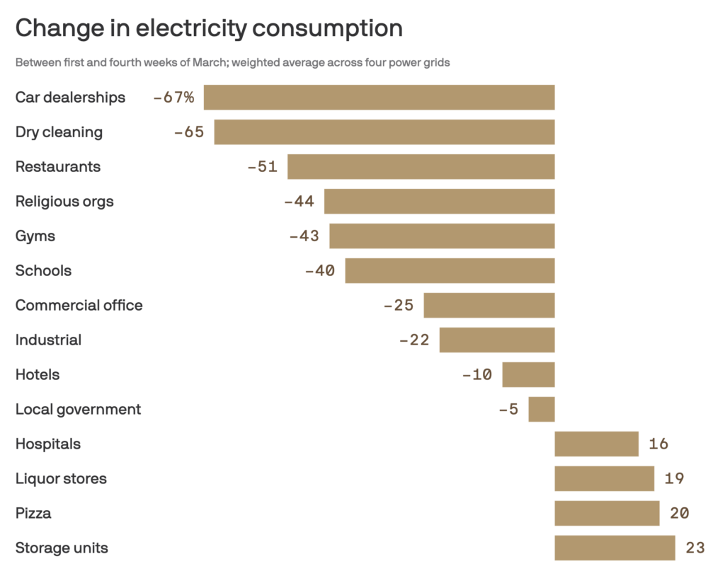
This is an amazing chart, via Amy Harder at Axios:
Driving the news: Those inferences are from new power data tracked by analytics company Innowatts. Since electricity consumption directly correlates to human activity, it offers a window into how businesses are faring as much of the country is locked down.
How it works: The chart shows the percentage change between the first full work week of March to the last full work week of March.
Source:
Where coronavirus is fueling more and less energy use (Axios)

Leave a Reply