Executive Summary
When it comes to navigating the world and understanding our surroundings, abstraction (i.e., the process of extracting the higher-level essence of something to formulate general ideas of concepts) is very important. We are constantly formulating and updating mental maps of our world for the purpose of carrying out goals. Abstraction is particularly relevant in a field like financial planning, where we deal with abstractions that are not only more complex than simple, physical objects (e.g., a tangible concept like a chair), but also that represent concepts that are complex and abstract themselves (e.g., the concept of preparedness for retirement).
One difficulty with developing abstractions is that ‘ideal’ levels of abstraction are simply not self-evident. In one context, a ‘high-resolution’ abstraction (e.g., one with very specific information, like the scientific name for a certain species of rattlesnake, ‘Crotalus atrox’) may be ideal, whereas in another context a ‘low-resolution’ abstraction (e.g., a broader, less detailed description, such as ‘living organism’) may be best. Yet, in other circumstances, some middle-ground abstraction (e.g., ‘rattlesnake’) may be most useful. The level of abstraction that is ideal depends on many factors such as one’s environment, the knowledge level of those we are communicating with, and the need to convey certain pieces of information. This is why a group of advisors can communicate just fine using industry jargon, while that same industry jargon could be a barrier to communicating with a client.
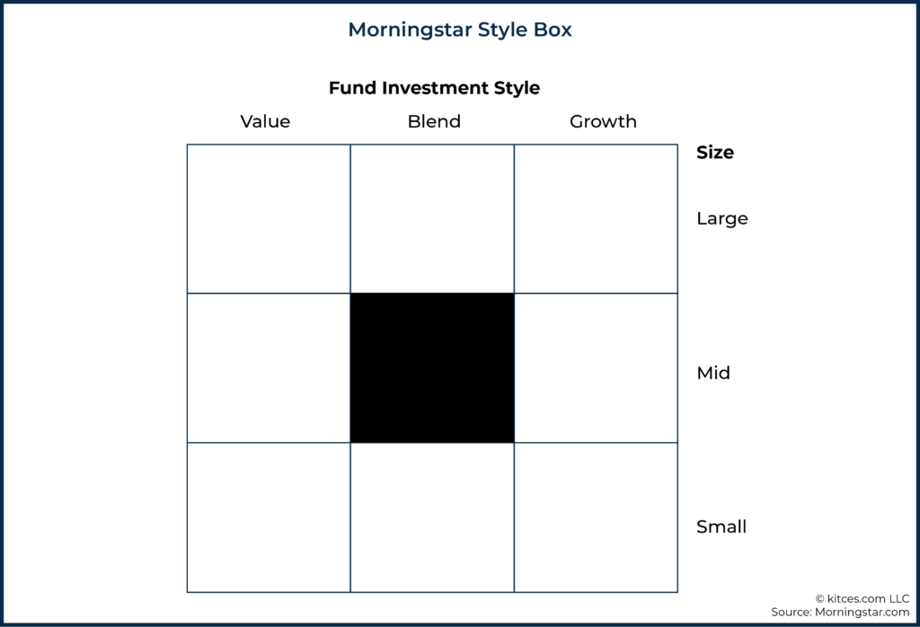
Perhaps one of the best abstractions ever developed within financial planning is the Morningstar Style Box. By capturing two of the most crucial dimensions of equity returns within a single, easy-to-read graphic, the Morningstar Style Box conveys a tremendous amount of important information about a stock portfolio in a highly efficient manner. The Morningstar Style Box also has the advantage of reporting two primary dimensions, which lends itself to presentation in a two-dimensional graphic that remains easy for our brains to interpret. However, once we get out to three dimensions (and particularly four or more dimensions), the added complexity can actually diminish our understanding rather than enhance it.
Despite the success of abstractions such as the Morningstar Style Box, however, abstractions used for many other key concepts within financial planning are severely lacking. For instance, ‘probability of success’ – the primary metric used for conveying preparedness for retirement within most modern planning software – is known to have a number of issues. In particular, ‘probability of success/failure’ entirely misses the dimension of ‘magnitude of success/failure’, which is highly important for developing a rich qualitative understanding of a retiree’s plan dynamics. For instance, a plan with a high probability of failure and a low magnitude of failure is significantly different than a plan with a low probability of failure and a high magnitude of failure, but in a world where only ‘probability of success’ is reported, then these two plans will look identical.
Notably, the problem with many Monte Carlo-based retirement analyses is not necessarily with Monte Carlo itself, but with trying to find a better abstraction for communicating Monte Carlo results. At a minimum, an ideal abstraction likely needs to cover both relevant likelihood and magnitude of success/failure. Furthermore, an ideal abstraction should convey that success/failure themselves can be a bit inaccurate in a world where ‘adjustment’ can avoid the most extreme outcomes. And finally, we also want to consider what may even be most important to report to a client in the first place, as it is possible that Monte Carlo metrics can largely live behind the scenes while planning results can be reported in a manner that is more directly relevant to clients (e.g., How much can my portfolio go up/down before I have to make a change? How big of a change would I need to make?).
Ultimately, the key point is to simply acknowledge how financial advisors abstract results that are reported to clients matters. The ideal level of abstraction is not self-evident and varies by context, but it is quite clear that ‘probability of success’ leaves a lot to be desired. We’re still at an early stage of figuring out what those abstractions may be, and most dominant platforms currently have quite limited ability to report anything other than the focal point of ‘probability of success’. We, as advisors, should be thinking about developing better ways to communicate with clients and, if the current tools don’t provide ideal levels of abstraction, letting software providers know that we want more than ‘just’ probability of success!
Abstraction is a key tool in how humans perceive and navigate the world. We create mental models and maps of the world that help us navigate and try to make sense of our surroundings.
Abstractions are also really important for communication. At different times, different levels of abstraction are useful for effectively communicating.
For instance, consider the following image:

We can abstract what this image represents at any of the following levels:
- Living organism
- Animal
- Reptile
- Snake
- Rattlesnake
- Crotalus atrox
Depending on what message one is trying to convey, any of these abstractions may be best suited for communication.
If, for instance, I just watched one of these creatures crawl into your tent, a casual warning that there’s either a ‘living organism’ (what would be a ‘low-resolution’ abstraction) or a ‘Crotalus atrox’ (a ‘high-resolution’ abstraction) in your tent would probably not be appreciated. ‘Living organism’ is far too generic to convey the potential risk of the situation and ‘Crotalus atrox’, although technically more precise than ‘rattlesnake’, is simply too technical to conjure a useful mental image for most non-herpetologists. Instead, ‘rattlesnake’ would likely be the preferred level of abstraction to warn you about what just crawled into your tent.
Even a relatively similar abstraction here – like ‘snake’ –is still considerably less insightful, since while it still does convey the particular type of reptile in the tent, we don’t know whether it is a harmless garter snake or a venomous snake that could threaten a human’s life.
As Jordan Peterson, a psychology professor at the University of Toronto, explains:
Perceiving the world and then figuring out how to act in it turns out to be a much more complicated problem than we originally thought, because the borders between things are not self-evident. And what level of resolution you should be perceiving things at for, say, maximal functional utility, is also not self-evident.
In other words, there’s no single level of abstraction that is going to be ideal for all situations. Obtaining the “maximal functional utility” is going to depend on circumstances, goals, etc. Perception is a trickier issue than we often appreciate, but it is still highly important because we must first perceive the world before we can try to figure out how to act in the world!
And all of this talk of abstraction is particularly important for advisors, since one of the most valuable things advisors do for clients is explain financial matters in a manner that helps clients make good financial decisions. Which means discussing matters at the appropriate level of abstraction.
After all, in attempting to fulfill this service for clients, an advisor’s messaging could end up being abstracted at a level that is either too high or low of a resolution, resulting in lost meaning at crucial moments (e.g., “there’s a Crotalus atrox in your tent!”). Which is even more challenging when recognizing that because the right level of abstraction depends on the context (as one herpetologist explains “this specimen is a Crotalus atrox” to another), there is no ‘perfect’ level of abstraction, per se, but only an ideal level of abstraction given a particular task or decision at hand.
Accordingly, the advisor may adjust the ‘resolution’ of the messaging depending on the client’s financial knowledge and acuity. For example, clients who are deeply interested in learning the nuances of financial concepts the advisor is teaching may need more detail and information, and would thus benefit from a high-resolution abstraction (e.g., an engineering-type client that actually wants to review all plan inputs in depth). On the other hand, a client who simply wants to know just enough so that they can understand the reason that reminder nudges are needed may appreciate a discussion that includes a lower-resolution abstraction (e.g., a client who just wants to know how much they can spend with some guardrails for making spending adjustments, without getting into all of the details).
Missing The Boat: Monte Carlo Simulation Results
Eshin Jolly, a computational social neuroscience post-doctoral fellow at Dartmouth College, offered a presentation where he discusses the ideal abstraction of software. Jolly describes how the software tools we use can actually limit how we think about concepts. According to Jolly, “You want to manipulate a tool to test your idea, not manipulate your idea to test a tool.”
This largely describes the current state of how financial planning software reports Monte Carlo results. The dial and ‘probability of success’ are so prominently displayed that it provides a strong incentive for advisors to present results framed around the probability of success.
But probability of success alone does not convey enough information to have a solid understanding of Monte Carlo simulation results, as this unidimensional presentation that considers probability of success alone entirely ignores magnitude of failure.
As such, only telling a client their probability of success provides a very low-resolution abstraction of their overall financial plan. Worse yet, ‘probability of success’ also does not convey to clients that they can adjust their spending to avoid failure, which further paints a distorted picture of reality. While this abstraction can perhaps be improved by framing around ‘probability of adjustment’ (i.e., the likelihood that the client will need to make an adjustment to the original plan in order to avoid failure), it is nonetheless woefully incomplete without addressing the dimension of magnitude.
Jolly notes that to best facilitate understanding, we want to be careful about allowing software to abstract away our ability to actually understand what is going on. Furthermore, Jolly suggests that abstraction should ideally facilitate conceptual scaffolding—i.e., a presentation of results that naturally guides one to the information needed for a proper understanding of their situation. For instance, in an investment context, an example of good conceptual scaffolding might start with teaching the basics of stocks, and then the mechanics of call and put options, and then how a strategy such as a protective collar works. The ‘scaffolding’ works to guide the learner to the ultimate goal (e.g., understanding a protective collar), in a manner that wouldn’t be effective if you started off trying to teach someone how a protective collar works without the proper intellectual foundation.
The ideal level of abstraction, then, is the level that provides for this sort of conceptual scaffolding and promotes a clearer understanding of a client’s situation. Current solutions (e.g., examining probability of success and/or probability of adjustment) arguably fail both advisors and clients, since even if advisors understand the shortcomings of Monte Carlo results and try to put them in context for their clients (e.g., by explaining that ‘failure’ is really more akin to ‘adjustment’, and that many plans can potentially be saved via the willingness to make modest spending cuts), they still aren’t armed with the information needed to actually explain a client’s magnitude of failure (or the magnitude of adjustments necessary to get back on track).
Hitting The Sweet Spot: Morningstar Style Boxes
The Morningstar Style Box is arguably one of the best – if not the best – examples of hitting the abstraction-level sweet spot within the advisory industry.
Thinking about low- versus high-resolution abstractions within an investment portfolio context, a high-resolution abstraction might be akin to a very detailed portfolio report with many pages and tens or hundreds of different data points reported throughout. It has all of the details, ratios, and other metrics you might want to know about a portfolio. This high level of detail, however, is cognitively demanding to assess.
By contrast, Morningstar Style Boxes are low-resolution abstractions. The composition of the portfolio is effectively distilled into two dimensions: size and value. Consistent with insights from the Fama-French three-factor model (which considers size, value, and market risk factors) regarding which factors are most important in explaining equity returns, style boxes happen to capture the most important dimensions of equity returns that (at least historically) have been important for understanding expected portfolio returns.
Therefore, this style box abstraction has practical value for advisors. Furthermore, because it is a low-resolution abstraction, it is cognitively very simple to derive insights from this representation. Which in turn helps to explain why its use has been so enduring and persistent; high-quality abstractions that convey the right level of information when needed are very useful!
Of course, if our use case demands some particular piece of information that is abstracted away from this representation, then the representation will be of low value to us. For instance, if you need to know what percentage of stocks within a fund have market capitalizations that place them within the eighth decile of US stocks, a Morningstar Style Box is simply not going to be able to answer that question. Even so, the Morningstar Style Box continues to be so successful among advisors precisely because it abstracts at the ‘right’ practical level for educating and advising clients on the equity portion of an investment portfolio.
It is probably also not a coincidence that the Morningstar Style Box captures two primary dimensions, since two-dimensional abstractions tend to be fairly easy for our minds to process and understand (other examples include two-dimensional risk tolerance, and even Markowitz’s efficient frontier that plots expected returns and standard deviation).
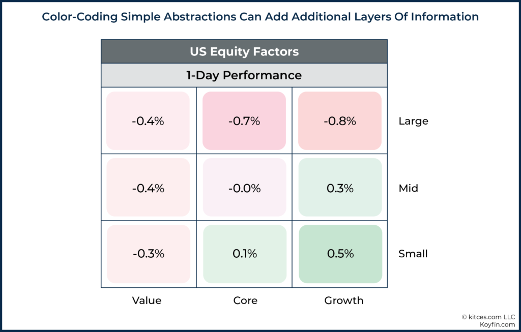
Another advantage of the style box presentation is that it can easily be modified to present additional information. For instance, Koyfin (among others) presents color-coded market returns within a style box format in a manner that quickly conveys how different segments of the market performed on a given day. The colors become the third dimension of the abstraction, adding further context but in a manner that does not overwhelm our ability to process the information.
Ultimately, the Morningstar Style Box quickly conveys information about a fund (or portfolio) across the two most important dimensions of equity investing: size and value. Extra details could be nice to know, but assuming a fund is reasonably diversified, they tell us very little.
Furthermore, abstracting at any higher of a level would leave us with too little information, as reporting just size or value alone would leave out an important piece of information. So, in the end, the ‘just right’ abstraction for practical application helps explain why Morningstar Style Boxes have been incredibly popular and broadly imitated throughout the industry.
Getting Monte Carlo Abstraction Just Right
The two dimensions that are most important to reporting Monte Carlo results abstracted at a level that conveys practical information are (a) likelihood of adjustment and (b) magnitude of adjustment.
However, it is still quite unclear how these metrics should be expressed.

Nerd Note:
The dimensions suggested above are not probability of success and magnitude of failure, although they are similar in some respects. While success/adjustment may be useful to interchange for the purposes of trying to communicate better, from a purely mathematical perspective, they are slightly different. For instance, it is not just scenarios that “fail” that would trigger spending adjustments. Instead, scenarios that start toward a path of failure would also trigger adjustment, which in some cases will ‘save’ the portfolio but in others will prove to have been unnecessary after the fact because the market recovers shortly thereafter; consequently, the mathematical probability that an adjustment would occur is actually higher than the probability of failure itself.
Likelihood Of Adjustment
Given the numerous issues with ‘probability of success’ as a client-facing term that have been noted, there are several different dimensions of abstraction we may want to consider with respect to crafting a better measure of likelihood of adjustment.
First, note that the use of ‘likelihood’ is intentional here, if only to draw attention to the fact that perhaps something other than ‘probability’ could actually be more useful. ‘Probability’ still seems like a good candidate, but if we’re thinking outside of the box, then we probably shouldn’t commit ourselves too soon.
The key to searching for an ideal abstraction is to think about what clients ultimately want to know. Clients probably want to know something to the effect of “How likely is it that I will have to cut my spending in the future?”
From there, there are yet further considerations. Do clients want to know the likelihood that they will have to make a year-to-year cut? Do they want to know the likelihood that they will need to cut below some threshold (e.g., some predefined desirable spending level or ‘minimum acceptable’ standard of living)? Should cuts ‘count’ if they only occur after increases had pushed their spending up in the first place (such that they ‘cut’ but not below the point that they started originally)? How should we think about ‘cuts’ that were anticipated as part of an overall declining spending pattern during retirement to begin with?
These are by no means straightforward questions. Furthermore, any abstraction that is too hard to understand, or otherwise doesn’t quickly convey the relevant information, is unlikely to be effective to help guide client decisions. So, any abstraction that is itself too complex may be self-defeating.
Probability of adjustment has been proposed as a potential alternative to probability of success. This metric has the advantage of potentially mapping very closely to how probability of success (or failure) is commonly used today. However, even still, there’s a question of whether we might want to think about what ‘adjustment’ means in this context.
In the case where ‘probability of adjustment’ is merely just a substitute for probability of failure (or the equivalent of 1 – Probability of Success) that is dominant today, then by ‘adjustment’ what we are really referring to are scenarios that did run out of money and therefore should have adjusted at some point prior.
In practice, adjustment was probably prudent for many scenarios that came close to depleting assets (or otherwise dipped very low at some point) even if they subsequently recovered, so if the hope is to convey a clear picture of the likelihood that a client will need to take prudent actions to reduce spending, then perhaps we want to think about identifying ‘adjustment’ scenarios differently than those that completely run out of money (or dip below the desired legacy value).
Metrics related to actual adjustments experienced within simulated iterations are an alternative method that may be useful in thinking about likelihood of adjustment. For instance, some baseline of desired spending could be defined, and then iterations that ever dipped below that baseline could be classified as downward adjustment scenarios. This would likely convey the downward type of adjustment that is most relevant to the client. In effect, the practical question this would answer is “What is the likelihood that a client’s spending has to be adjusted down below some target threshold at any particular point during retirement?”
While our focus thus far has primarily been downward adjustment, it is worth noting that conveying information about upward adjustment may be really useful for clients as well. After all, in most scenarios, those who follow rules of thumb, such as the 4% rule, will actually end up being able to spend far more than initially planned, and sequence-of-return risk has a significant upside component as well.
Similar to considerations for measuring downward adjustment, actual increases experienced in simulated iterations could be a measure of upward adjustment. Alternatively, some threshold could be defined to indicate what counts as upward adjustment if we don’t want to, for instance, count increases that followed decreases and are really just a return to the original baseline (e.g., where the client cuts their spending by 10% for 3 years in response to a decline in the market, and then gets a subsequent spending “increase” that in practice merely gets them back to where they were in the first place).
Perhaps the simplest solution is to define a ‘planned’ income (i.e., the spending planned for each year at the time the plan is run) and measure adjustments below or above that level. Again, there are all sorts of nuanced considerations (e.g., Is it time spent above/below plan? Frequency of adjustments above/below plan? Etc.), but the key point is just that reporting simulated experiences relative to a ‘planned’ spending path would help convey to clients how likely they are to be able to spend more or less than ‘planned’ under various scenarios.
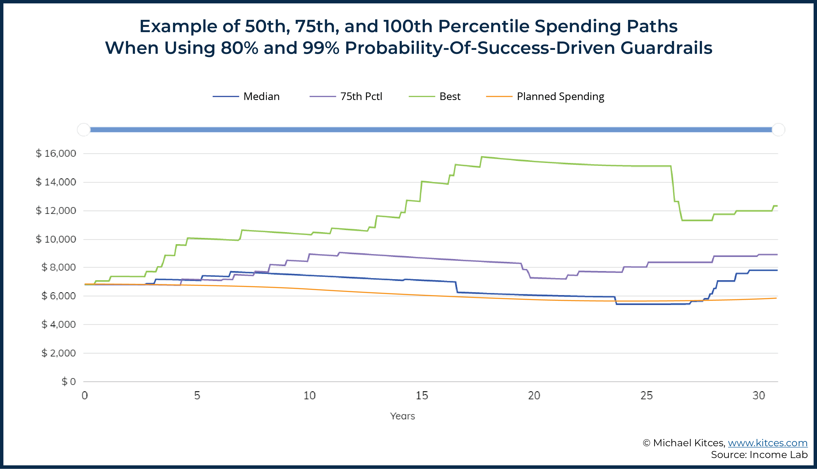
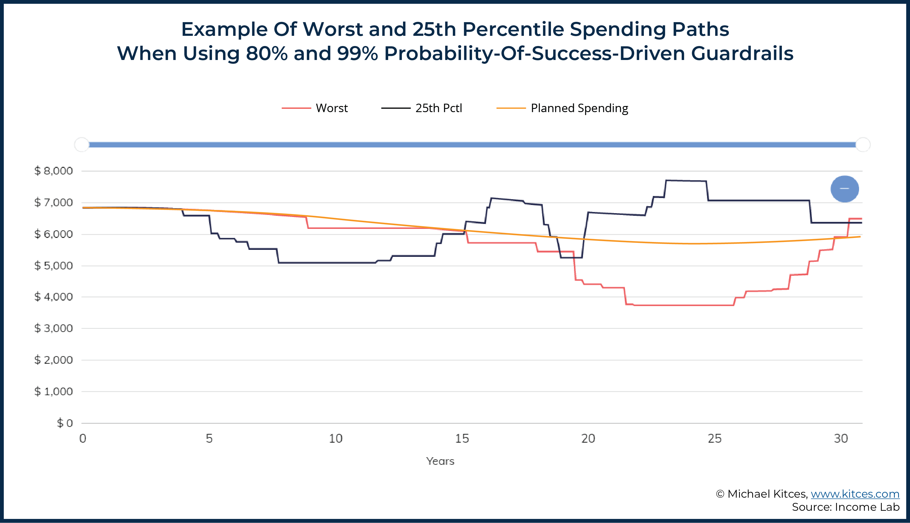
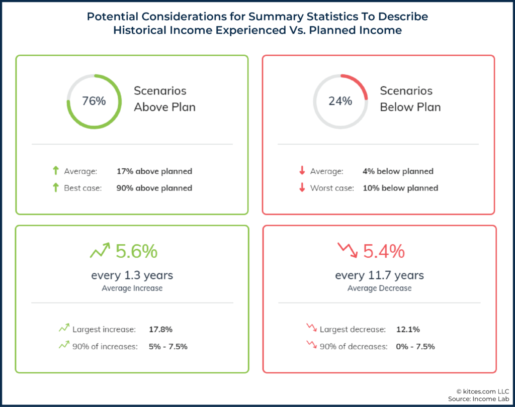
For instance, consider the graphics below, which include a ‘planned’ spending path (orange line) that is intended to decrease inflation-adjusted spending in a manner that roughly aligns with Blanchett’s retirement spending smile. We can also see a wide range of additional historical spending paths for someone who was using an 80% lower guardrail and 99% upper guardrail probability-of-success-driven guardrails approach (see here for further description of the approach and assumptions underlying the graphics below).
As we can see in the graphics above, more scenarios were above ‘planned’ than below ‘planned’. Additionally, we can use some of the statistics from the graphic below to try to describe the outcome of the analysis (e.g., 76% of scenarios above plan versus 24% of scenarios below plan), but the key point here is not so much the metrics suggested below as it is simply acknowledging that there is a range of potential ways that we could try to describe plan results, and there’s yet to be any commonly accepted metric for reporting such results (unlike the example of the Morningstar Style Box).
One additional benefit of comparing against a ‘planned’ scenario is that the planned scenario can itself then accommodate general trends in spending (e.g., declining spending throughout retirement) or client-specific spending patterns (e.g., a client who knows they want incorporate particular goals at various points in retirement, such as higher spending in the early years for additional vacations, a child’s wedding in 5 years, and grandchildren’s college expenses in 25 years).
From an abstraction perspective, this approach also has the added benefit of being very straightforward to convey and understand (e.g., “Mr. and Mrs. Client, you indicated that you were happy with a particular spending path, and what our software is showing you now is the likelihood that you are able to spend more or less than that amount during retirement.”).
Magnitude Of Adjustment
While the likelihood of adjustment at least has some comparable metric (probability of success) within existing financial planning software, the magnitude of adjustment is a concept that is far harder to get at with existing retirement tools.
Richard Fullmer proposed Shortfall Risk, a single metric that would capture both the probability of failure and magnitude of failure:
Shortfall Risk = Probability of Shortfall * Magnitude of Shortfall
In the equation above, Probability of Shortfall is expressed similar to Probability of Failure (i.e., 1 – Probability of Success) in most Monte Carlo analyses. Magnitude of Shortfall is the amount of money one wanted to spend but could not because they ran out of money (expressed as a percentage of the initial portfolio value).
From an abstraction perspective, computing a single value of Shortfall Risk doesn’t really do much for conveying the qualitative nature of one’s prospects in retirement.
For instance, consider the following two scenarios:
- Scenario A: 50% probability of shortfall; 10% magnitude of shortfall (e.g., spending only has to be cut half the time, and when it is, the cut is only from $100k to $90k)
- Scenario B: 10% probability of shortfall; 50% magnitude of shortfall (e.g., spending cuts are unlikely, but if they do occur, it’s from $100k to $50k)
In terms of computed Shortfall Risk, both of these would measure the same (i.e., Scenario A = 50% × 10% = 0.05; Scenario B = 10% × 50% = 0.05), but clearly the two scenarios are qualitatively very different.
In Scenario A, the likelihood of adjustment is fairly substantial, but that adjustment is economically quite manageable for most (“just” a 10% spending cut). In Scenario B, on the other hand, the likelihood of adjustment is much smaller, but the magnitude of the adjustment is so large that it would entail a material alteration to the retiree’s lifestyle. Representing both as the same shortfall risk (.05 in this case) is not a very useful level of abstraction.
Arguably, Fullmer’s model is most insightful when the Probability of Shortfall and Magnitude of Shortfall remain as two distinct concepts. That said, so long as the software can provide the conceptual scaffolding that allows for drilling down further to investigate both components of shortfall risk, then perhaps a measure such as Shortfall Risk could work reasonably well.
After all, while the single number abstraction of Shortfall Risk doesn’t tell the whole story, so long as the Shortfall Risk is relatively low, we can reason that either (a) Probability of Shortfall is low, (b) Magnitude of Shortfall is low, or (c) the combination of (a) and (b) is low.
A preliminary result that grabs an advisor’s attention and concern (e.g., a high Shortfall Risk measure), could prompt drilling down further right away into the two components that comprise total shortfall risk and understand whether it’s a high probability of a moderate cut, or a low probability of a potentially more stressful (or outright catastrophic) required adjustment.
However, similar to how there are a number of different ways one might think about the likelihood of adjustment, there are additional ways to think about the magnitude of adjustment as well.
Notably, Fullmer’s Shortfall Risk approach really doesn’t convey how much spending adjustment would be needed in any practical sense. If the intent is to help individuals better understand their financial prospects in retirement (or make choices that may qualitatively influence their retirement), then a metric that better conveys the magnitude of adjustments needed to stay on track would be useful.
One approach for dealing with this particular question is summarizing the outcomes of planned versus actual spending in the various plan iterations that were considered in the analysis. For instance, summaries of the underlying iterations modeled in a Monte Carlo analysis (e.g., How much did spending increase/decrease? How frequently did spending increase/decrease? etc.) could be provided. However, again, there are many considerations for how to summarize such information. For instance, should it be average increases/decreases? Should it be the largest increases/decreases? Something else?
And furthermore, we again must consider how the baseline for measuring magnitude is defined in the first place. For example, is it relative to planned spending? Relative to year-to-year fluctuations? How do we even define triggers for modeling increases/decreases in the first place?
Ultimately, the key point is to emphasize that there are no obvious and simple answers to the questions above. There are, however, significant challenges associated with trying to find a better solution for abstracting Monte Carlo results to be understood by clients (and advisors!), but the current practices of emphasizing probability of success while entirely neglecting magnitude of failure are not sufficient for delivering practical insight about one’s prospects for financial success in retirement.
It does seem fairly clear that ‘probability of success’ does not work well as the focal point. That said, the concept of probability of success may survive as an important planning metric, but just one that needs to exist as a relevant metric and not the focal point (e.g., such as the case in a probability-of-success-driven guardrails framework).
If we are looking for direct replacements to probability of success, ‘probability of adjustment’ has a number of compelling advantages, even if the two are not mathematically perfect substitutes.
We can also note that two-dimensional abstractions are generally much better than one-dimensional abstractions. With this in mind, capturing both (a) probability of adjustment and (b) magnitude of adjustment are two highly relevant dimensions that will likely be useful for identifying better abstractions of plan results.
Unfortunately, capturing relevant metrics to help broaden the discussion with clients is very difficult to do using the dominant financial planning tools of today. Moreover, even if some statistics are available, there’s going to inevitably be a period of getting better at quantifying which metrics are the most relevant that will lead to some challenges until a dominant framework emerges.
However, in the meantime, advisors may want to at least think about ways they can provide greater qualitative context to plan results. Helping clients understand the potential magnitude of changes required, or even just how reliant they are on portfolio versus guaranteed income sources (since the latter will inevitably provide a greater ‘floor’ of minimum income), could be worthwhile considerations.
Furthermore, at a higher level, advisors may want to consider to what extent Monte Carlo results should even be the focal point in the first place. While such results are likely useful for helping clients understand their potential long-term income experience (and will therefore likely always have some role to play in the planning process), arguably the focus for managing shorter-term expectations on an ongoing basis could focus much more on simple guardrail-type metrics. For instance, within a probability-of-success-driven guardrails framework, Monte Carlo analysis is still doing a lot of behind-the-scenes work in setting the thresholds at which a retiree would increase or decrease their spending, but that gets entirely abstracted away to instead tell the retiree:
- How much they can spend now;
- The portfolio value they would need to achieve before getting an increase in their income (plus that increase amount); and
- The portfolio value they would need to achieve before getting a decrease in their income (plus that decrease amount).
The information above is arguably highly relevant to a retiree in terms of actually managing their spending and knowing when a change is coming. For instance, if a retiree’s portfolio value is currently $1 million and they know their ‘lower guardrail’ (i.e., the guardrail that would trigger a spending decrease) is $700,000, then that retiree may have a much better understanding of where they stand financially (e.g., they may not panic when their portfolio falls to $900,000), as well as the possible consequences that might result from experiencing that level of portfolio decline (e.g., perhaps they need to cut spending by $500/month). But, notably, all of that can be conveyed without talking about probability of success at all!
In the end, the key point is to simply acknowledge that how we abstract results that we report to clients matters. The ideal level of abstraction is not self-evident and could vary by context, but it is quite clear that probability of success leaves a lot to be desired. We’re still at an early stage of figuring out what those abstractions may be, and most dominant platforms currently have quite limited ability to report anything other than the focal point of ‘probability of success’, but we as advisors should be thinking about better ways to communicate with clients and, if the current tools don’t provide that ideal level of abstraction, letting software providers know that we want more than ‘just’ probability of success!
Disclosure: Derek Tharp is working with Income Lab as a Senior Advisor to help them implement different forms of Monte Carlo abstraction in their software. Income Lab was used in producing several graphics included in this article.



Leave a Reply