They’re going to invert the yield curve again.
But it’s mostly a function of Coronavirus fears and the Fed’s very widely telegraphed activities in the overnight repo market – flushing the system with cash to stabilize an otherwise mundane, routine process that can occasionally be overwhelmed by high demand for dollars, for a variety of reasons.
Here’s a chart I made of the collapse in the 10-year Treasury minus 3-month Treasury spread…
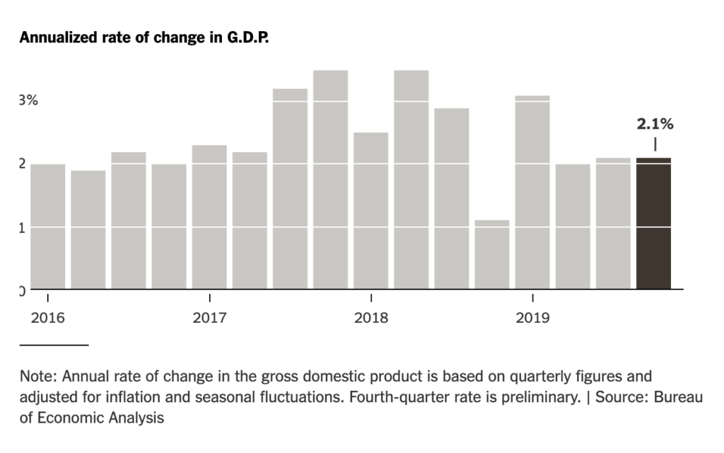
You can see that spreads broke back above positive in October, and now they’re headed back to breakeven or possibly negative (inversion). Understand that this is happening in response to things other than the state of the US economy, which is doing exactly what it’s been doing for a long time – somewhere between 2 and 2.5% GDP growth, quarter after quarter, with the labor market at multi-decade highs for employment. Official GDP figures for Q4 2019 came in this morning at a slow but steady 2.1%. Yes, it’s backward looking, but it’s also remarkably consistent.
The below chart is from the New York Times:
By which I mean to say, if and when the 10-year / 3-month inverts, don’t throw up in your mouth or pay too much attention to Team Panic.
For a quick refresher on why people follow the yield curve indicator, here’s Michael and I talking to the Godfather himself…


Leave a Reply